Lutron design system cover showing tablet with component library overview

Design system to align 10+ Lutron's web properties

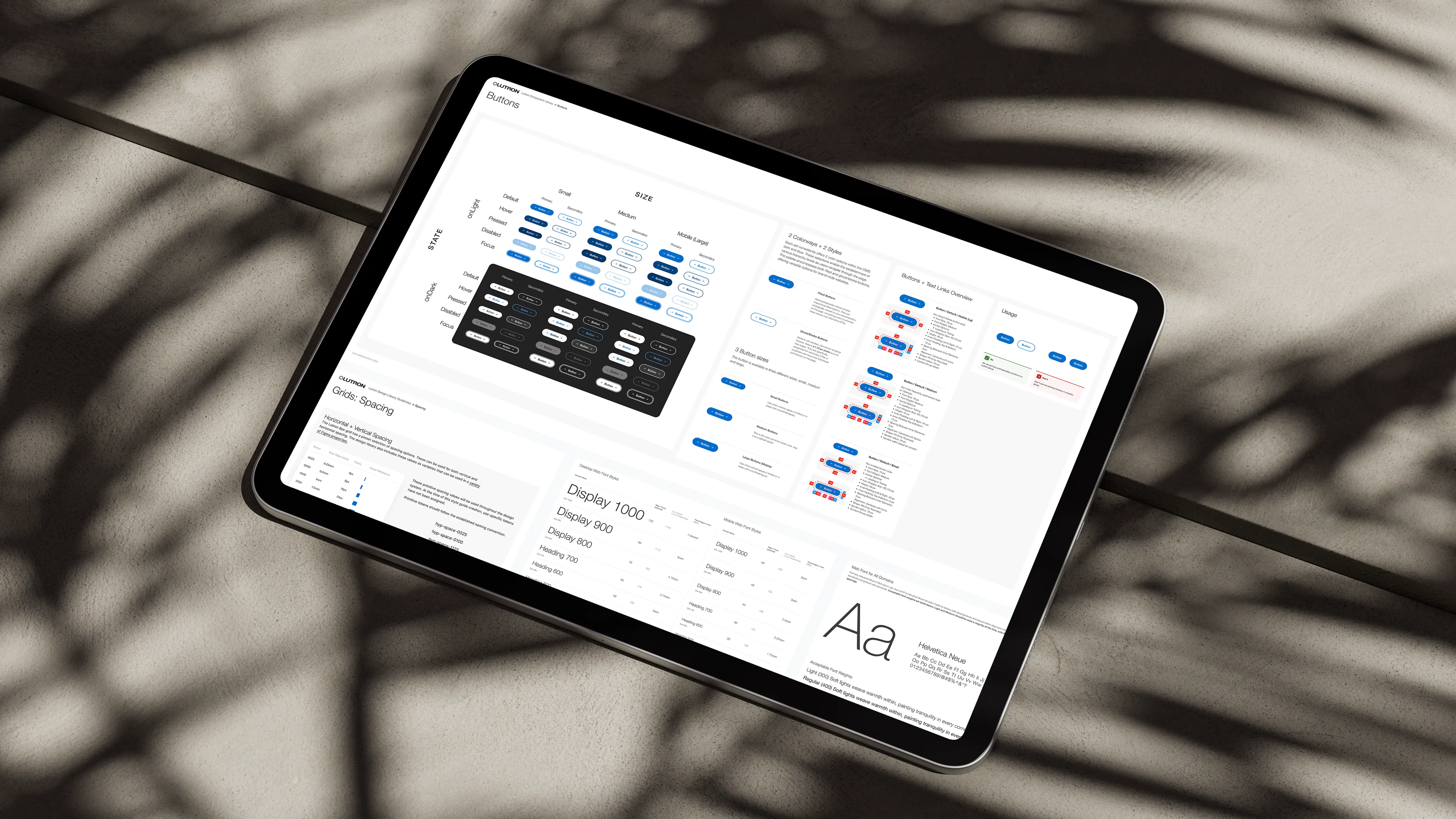
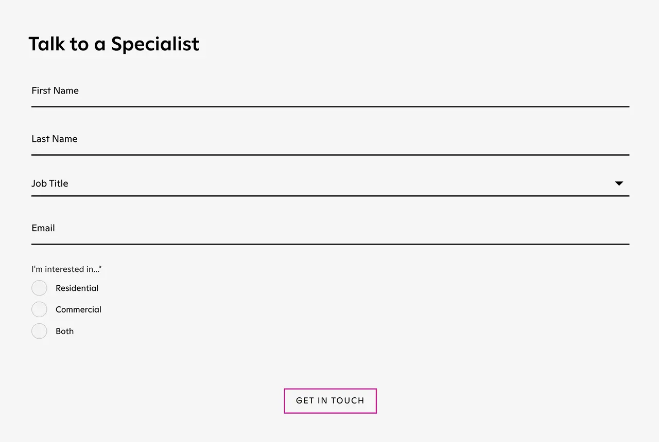
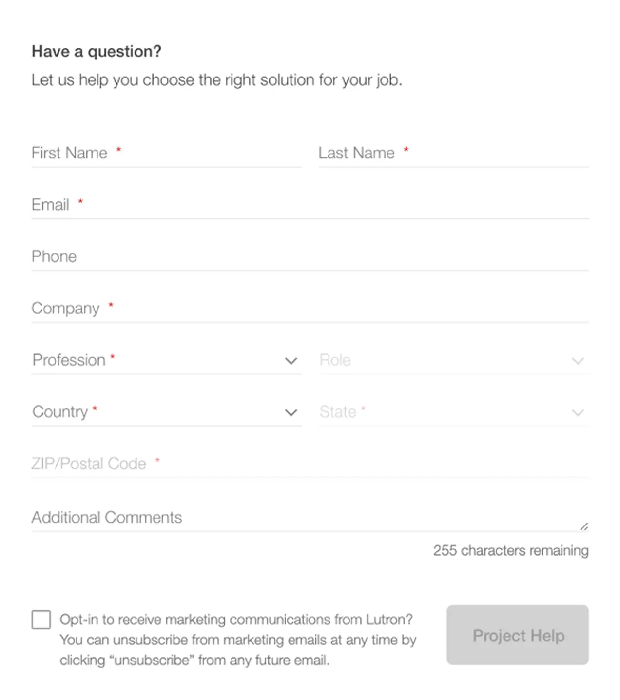
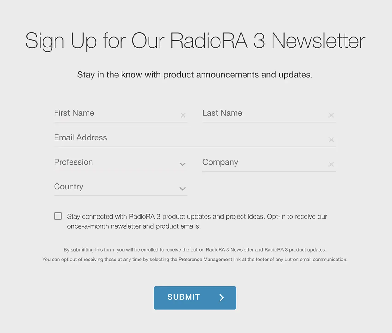
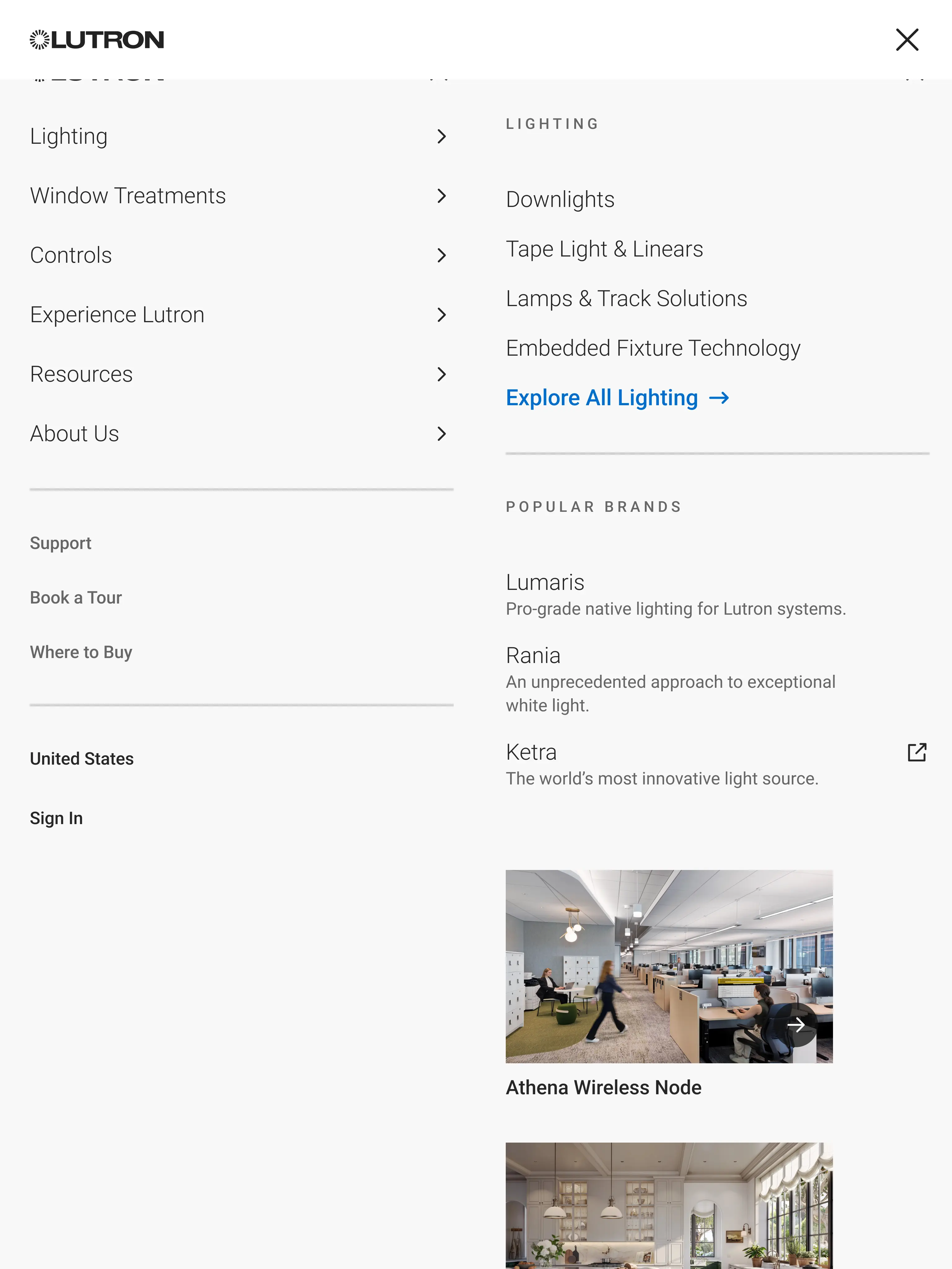
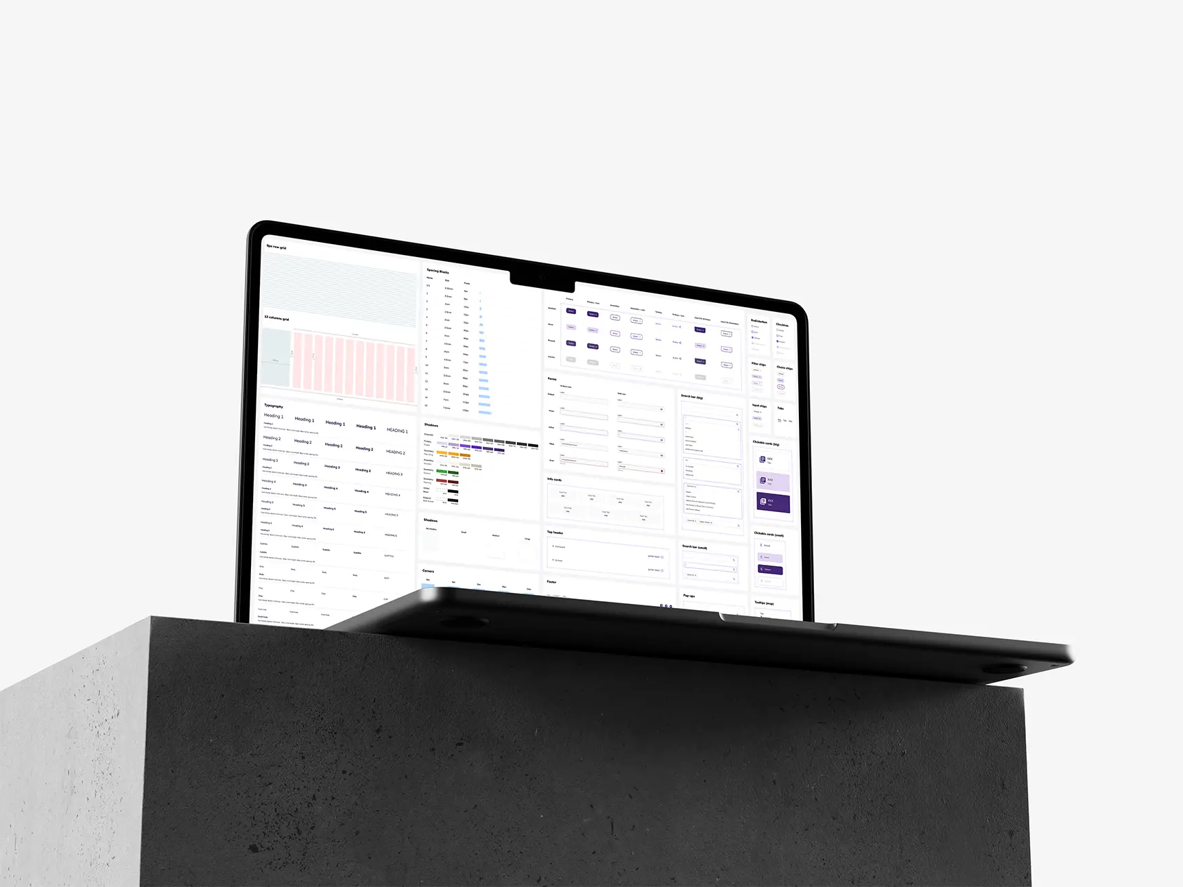
As a contract visual designer, I laid the foundation for Lutron’s first web design system to support a large-scale overhaul of 10+ public-facing websites.

The system aligned internal and external teams, sped up development handoffs, and created a consistent brand experience across 100+ pages.

Due to NDA (Non-Disclosure Agreement), sensitive details have been omitted while highlighting the essence of the project and my role.

Duration
3 months
My role
Visual Designer
Client

Fragmented experiences across Lutron’s web properties

Lutron Electronics, a global leader in smart lighting and home automation, had 40+ web properties designed and developed by different teams, each with its own design language, coding standards, and patterns.
A a result...
Customers
got confused navigating between sites
Designers
reused nothing and recreated everything
Developers
were re-coding the same components repeatedly
Brand trust and usability
were falling apart as users got more frustrated

No design system meant another costly, inconsistent redesign

We had to build a unified system while a major site overhaul was already in progress.
It needed to serve as a foundation for new features while also bridging and aligning the existing properties.

How we approached it

Reuse, don’t rebuild

Instead of starting from scratch, we evaluated existing elements across Lutron’s properties.
By adapting and expanding them, we sped up adoption and maintained familiarity for development teams.
Before
Variety of inconsistent button styles used across Lutron websites before design system
After
Standardized button system with consistent sizes, states, and color themes in Lutron design system

A modular system for scalability

We built on atomic design principles and adapted them to the project’s needs. The modular structure made the system scalable and easier to maintain across multiple properties.
Atomic design diagram showing styles, atoms, molecules, organisms, templates, and pages
Figma page structure for Lutron design system with styles, grids, typography, and components

Establish a token foundation

I created design tokens for color, spacing, typography, border radius, and more.
Organized into levels, these tokens defined key visual properties, standardized values across components, and made global updates fast and reliable.
Diagram of Lutron design tokens showing raw value, primitive, semantic, and component levels for color
Naming structure for design tokens with namespace, object, base, and modifier example for button color

Prototype-driven library

We used early overhaul prototypes to assemble a pattern library, ensuring new designs were immediately backed by systemized components.
Atomic design diagram showing styles, atoms, molecules, organisms, templates, and pages
Figma page structure for Lutron design system with styles, grids, typography, and components

Design and documentation in one place

We kept all documentation in Figma, creating a single source of truth. Clear guidelines, accessibility notes, and examples enabled faster, more consistent implementation across 100+ pages, without the need for extra tools.

Lightweight governance

To support scaling, we introduced a simple governance model:
A process to request or review new components
Clear ownership by the design team
Regular cleanups to retire unused patterns
This kept the system flexible and manageable without slowing things down.

Collaborating across teams

I worked closely with UI designers, product teams, and developers. Regular reviews helped us gather feedback, identify gaps, and adjust.
When new requests came in, we looked for ways to meet needs using existing components, saving dev time and avoiding redundancy.

Flexible and scalable design system

Configurable

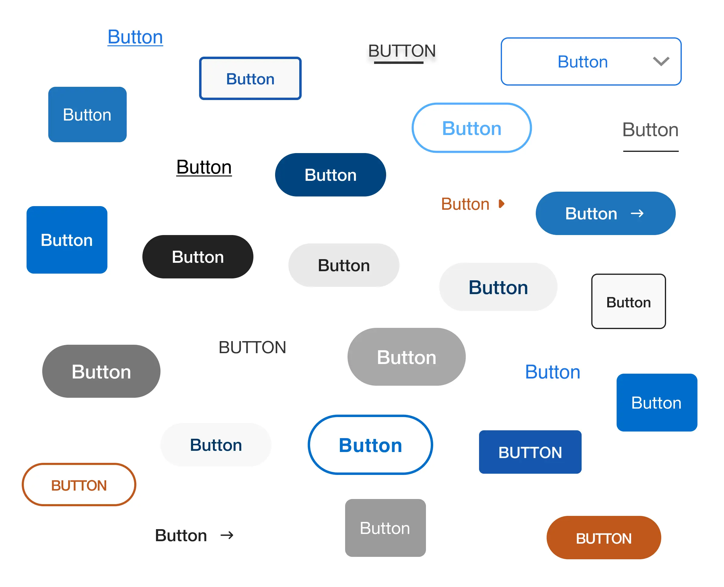
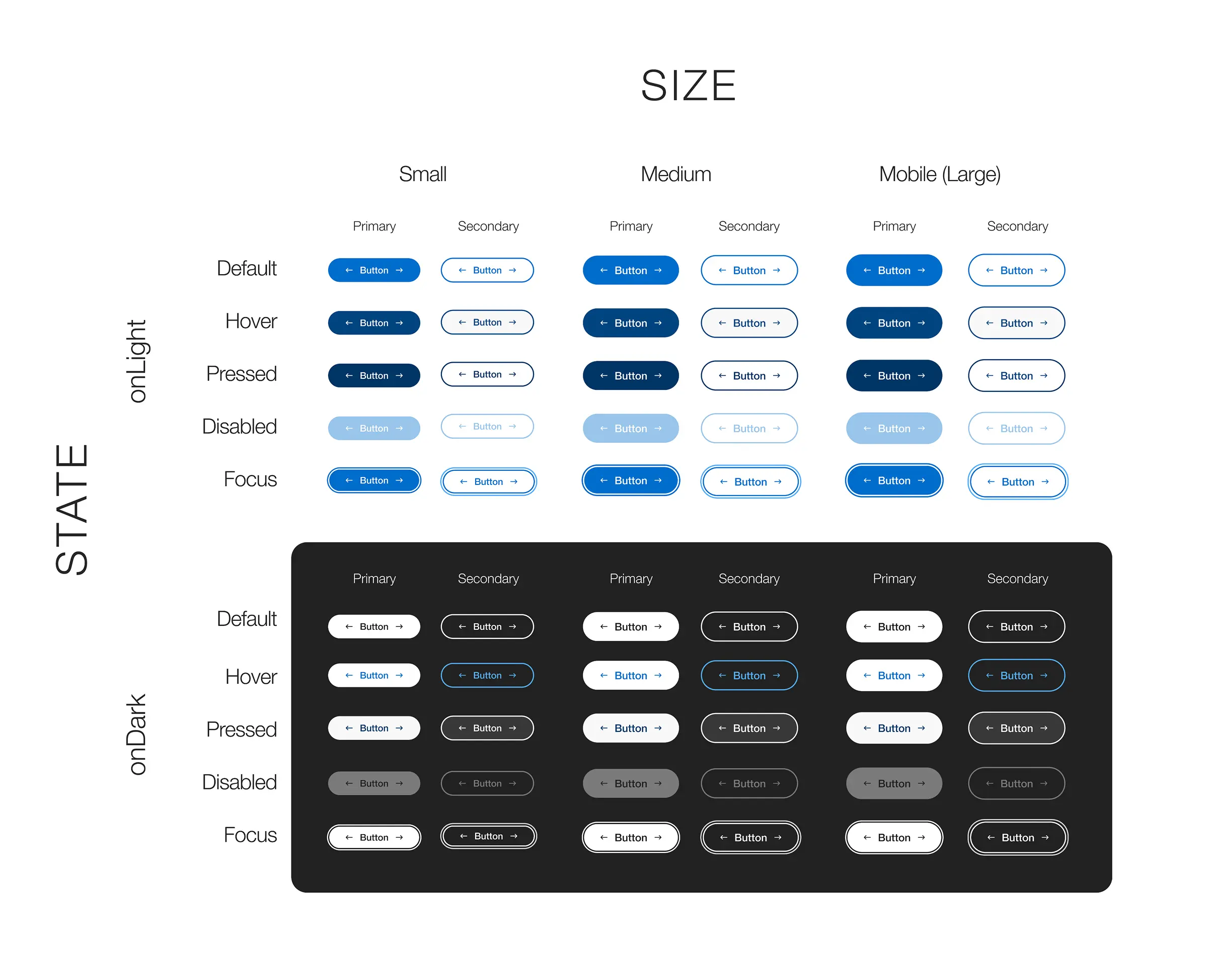
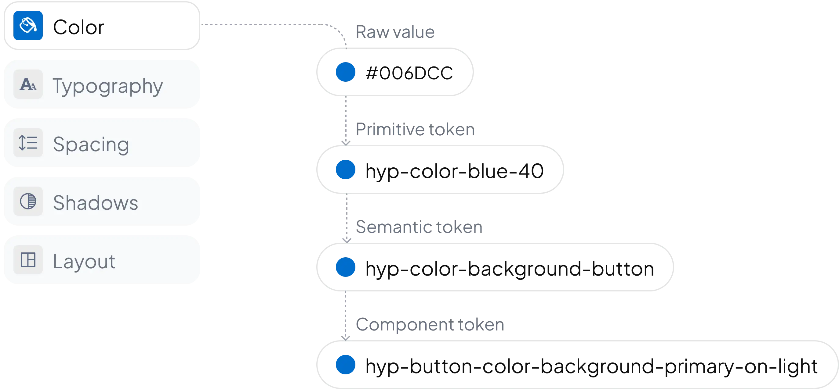
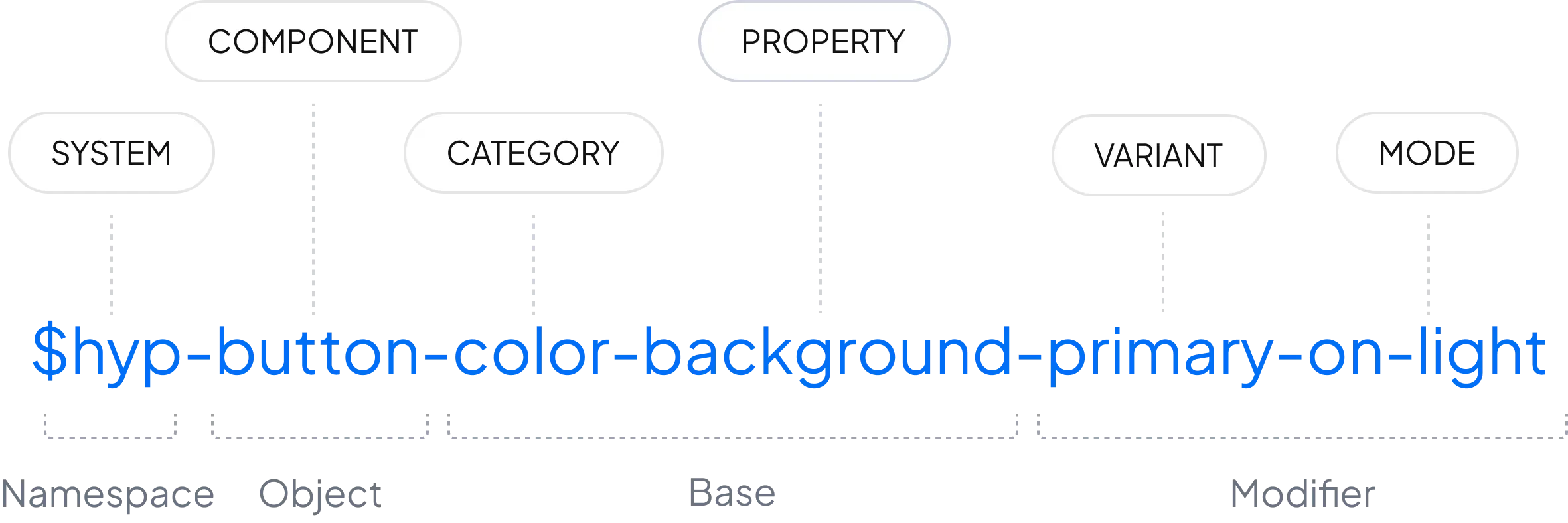
Components can be customized with Figma properties while staying consistent

Component configuration panels in Lutron design system within Figma, showing editable properties for button, blade, and global navigation components

Scalable

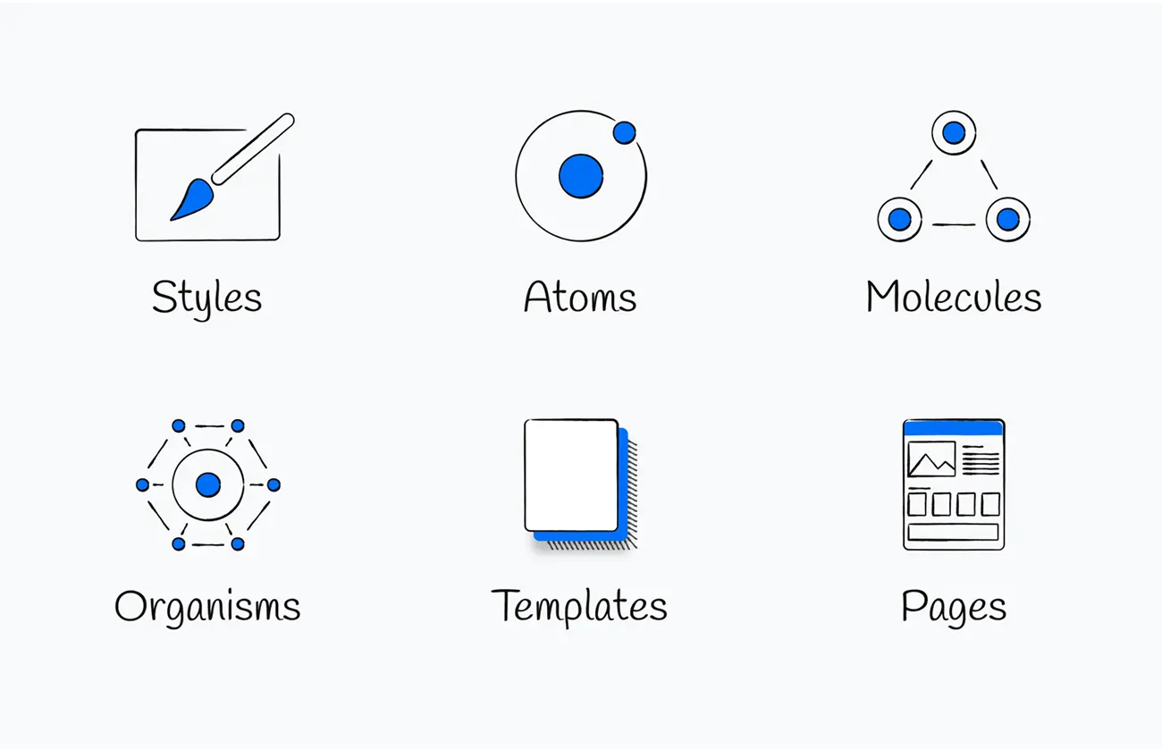
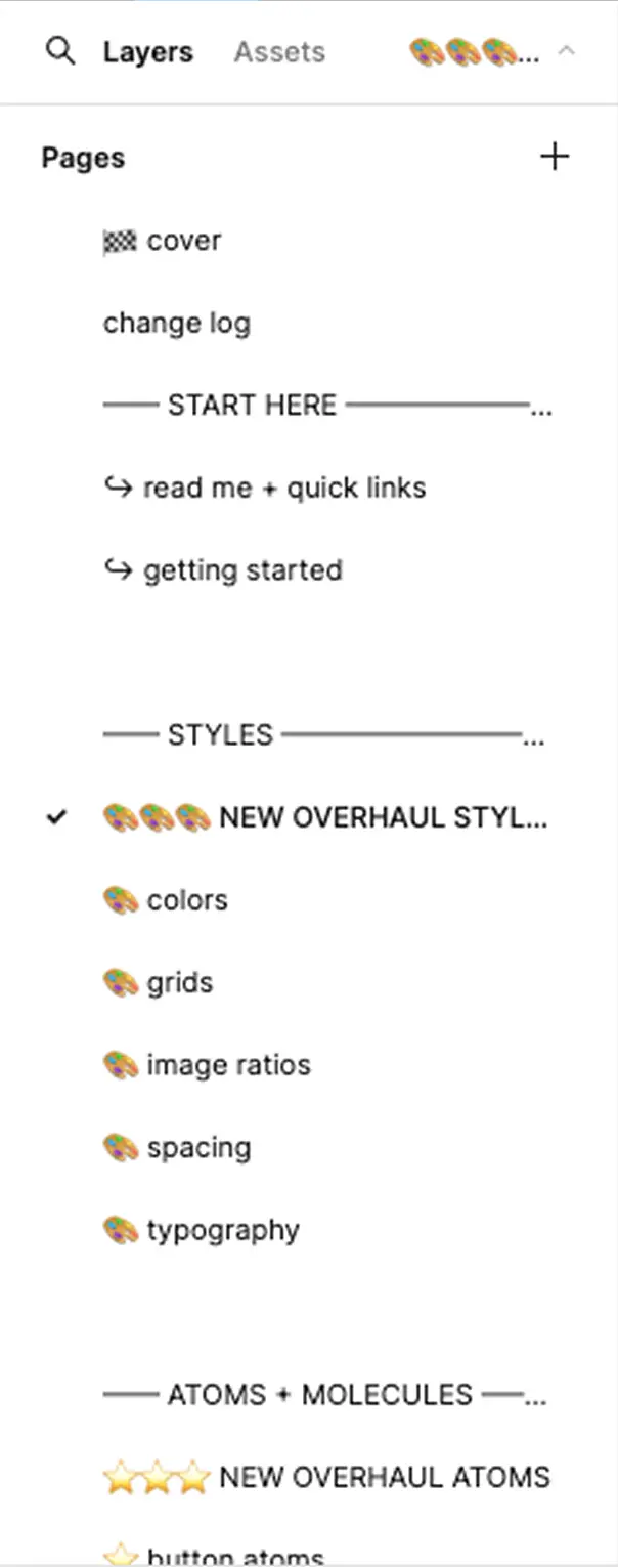
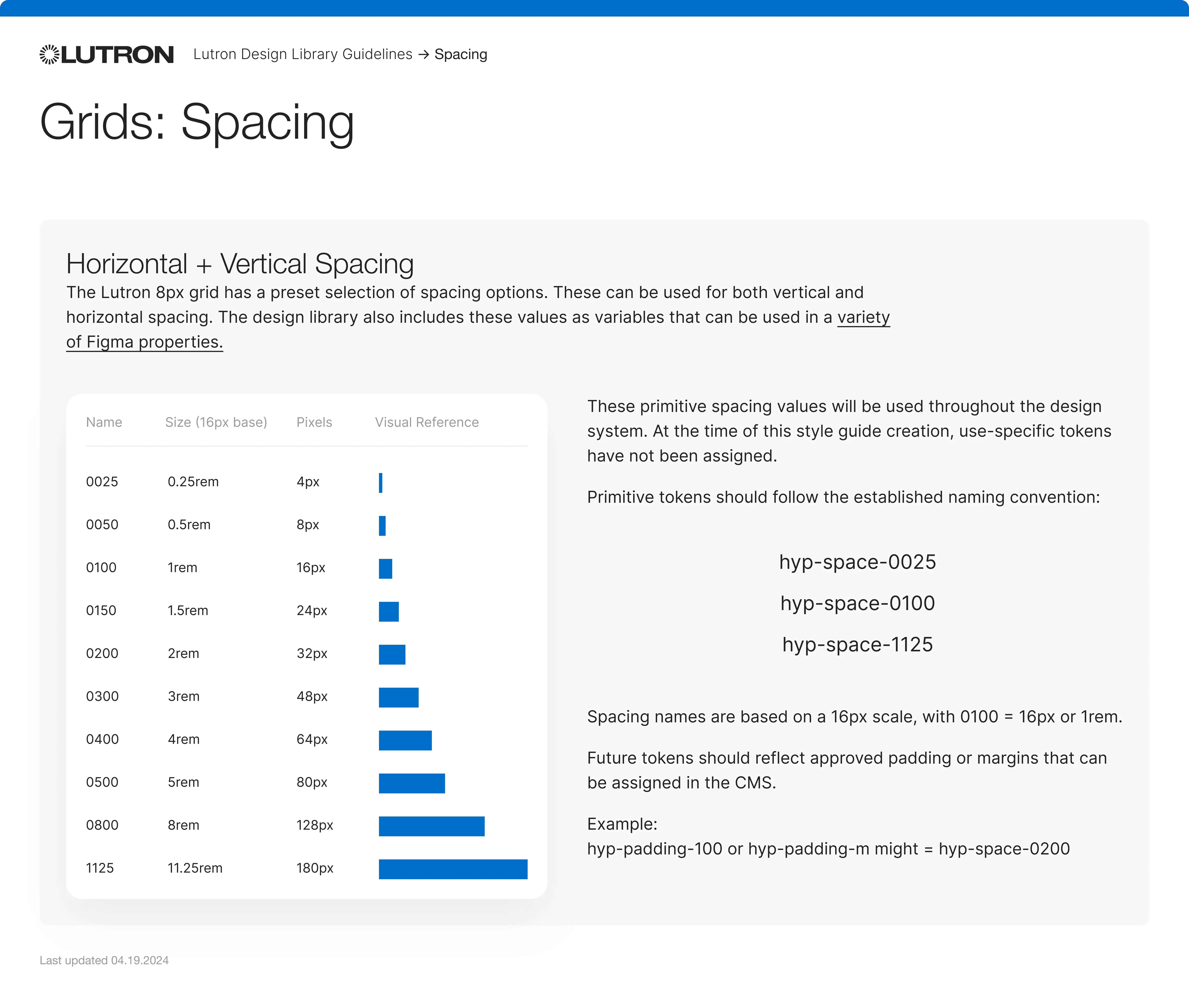
Each element is built from smaller parts, making the system modular and easy to expand

Scalable design system example showing footer and form patterns assembled from modular components

Accessible

All components meet WCAG 2.1 AA for contrast, navigation, and assistive tech

Lutron design system accessibility guidelines showing WCAG-compliant color palettes, responsive typography, focus states, touchpoint sizing, and error handling

The final design built with the system

The design system comes to life in the final product, ensuring visual consistency, efficient development, and an intuitive experience for users.
Laptop mockup showing Lutron homepage built with the new design system, displaying consistent navigation and layout
This is the homepage built with the design system. Everything is consistent, clear, and ready for users.

The difference we made

13
/38
Public-facing sites use the new design system
75
%
Less time spent on design reviews
+40
%
Better brand consistency
3
X
Faster to build new pages

Lessons learned

A good design system doesn’t just help designers. It supports better decisions across the board, from branding to dev handoff.
It should grow with real product needs, not imagined edge cases. And it’s not about perfection, it’s about clarity, speed, and trust.

What people are saying

“Karyna helped set the high standard for the work we would continue to implement with the new system and was instrumental in its early production.”
Laura Hersh
Lead Visual Designer, Lutron Electronics

I'm just an email away :)

I'm always open to connecting with great teams to explore new roles. If you're looking for a designer, I'd love to hear from you.