Hero image mockup of laptop screen showing design system component library

Design system for faster development

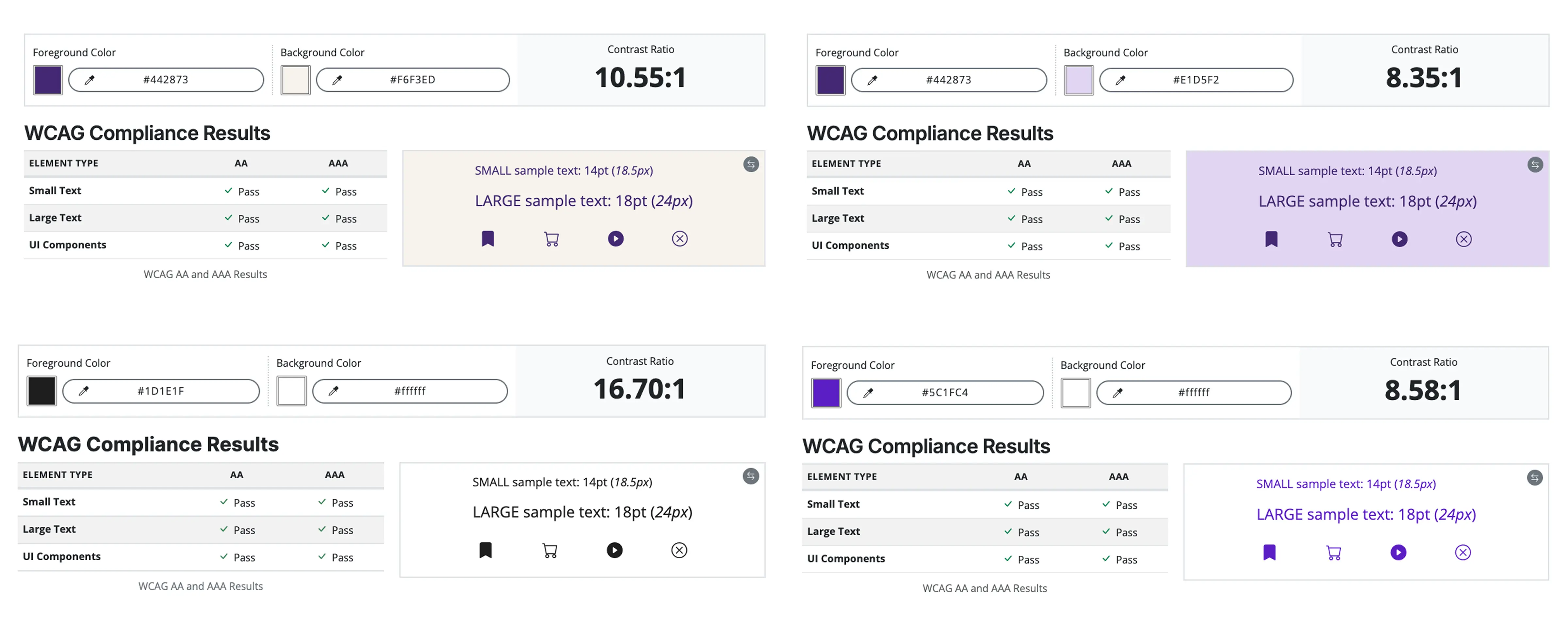
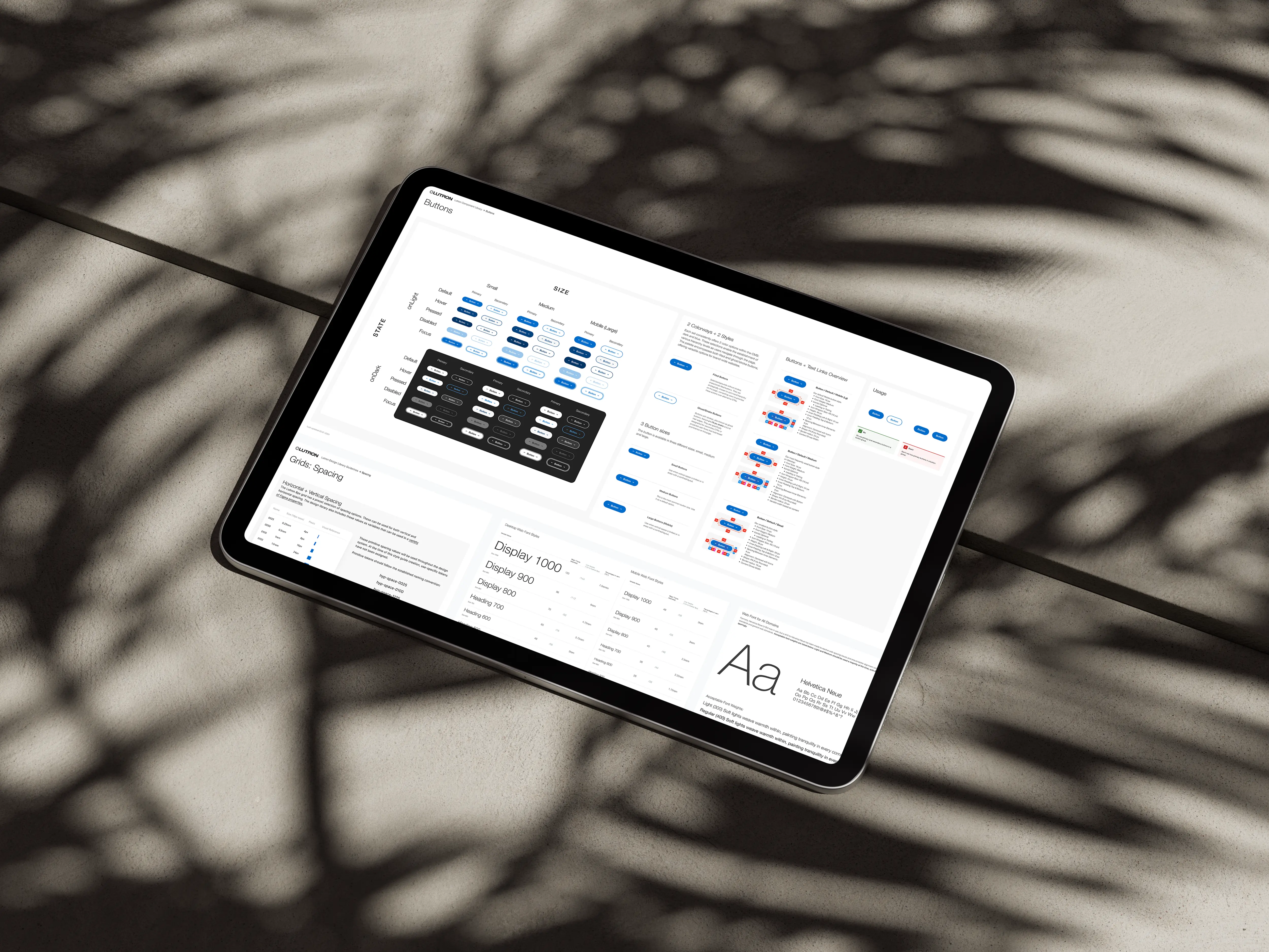
At Perceive Now, an AI startup, my teammate and I were designing an MVP for tech leaders and scientists. Constant pivots left components inconsistent and hard to maintain.

I led the creation of a lean design system, defining standards and components that improved consistency and accelerated both design and development.

Due to NDA (Non-Disclosure Agreement), sensitive details have been omitted while highlighting the essence of the project and my role.

Duration
2022-2023
My role
UX designer

Inconsistency slowed us down

Designing in parallel, we made different choices for identical components, such as tables with inconsistent padding and mismatched buttons.
Without a unified system, updates had to be applied screen by screen, slowing already tight timelines.
Competitive analysis matrix plotting competitors on two axes: direct versus indirect and legacy versus emerging

Convincing a feature-driven startup to value a system

Stakeholders wanted features shipped, not infrastructure. To get buy-in, we framed the design system as an efficiency tool: faster design, easier development, and more consistent output.
We built it alongside product work so its value was proven organically. Developers began reusing components before designs were finalized.

Creating consistency across 50+ pages

The product was the top priority, and stakeholders had little interest in a design system. To keep our Figma files and product pages consistent, I took the initiative to create one anyway.
I audited existing styles, defined standards, and built reusable components, which later saved the team time as the MVP expanded.

How we approached it

Audit and gap analysis

We started by auditing a style guide left by a previous designer. It covered basics like colors and typography but lacked grids, spacing, and standardized components. These gaps would only grow more visible as the product scaled.

Defining standards to keep work consistent

I applied Atomic Design principles to structure the system.
This modular hierarchy made components easier to maintain, scale, and combine across 50+ pages while keeping the library lightweight.
Atom-level components in design system showing foundational elements such as grids, typography, buttons, icons, and form controls
Atoms formed the foundation of the design system, defining the smallest reusable elements
Molecule-level components in design system showing inputs, cards, search fields, tabs, dropdown menus, and chart legends
Examples of molecules created to keep patterns consistent across the product
Organism-level components in design system showing data visualizations such as maps, charts, and data tables
Organisms built by combining molecules into complex, reusable components

Build reactively, not upfront

Instead of creating a large system at once, we added components as we built product pages, including navigation, buttons, and data tables.
Patterns like login flows and empty states were systematized immediately, keeping the library relevant to real needs.

Accessibility

All components met WCAG AA standards, with built-in contrast ratios, clear error states, and keyboard navigation, making the system more inclusive.
WCAG color contrast checker confirming chosen design system color combinations meet AAA accessibility standards
All system colors passed AAA contrast checks, ensuring accessible text and UI

Adoption through communication

With no time for formal documentation, we relied on direct communication: a Slack channel for design system questions and weekly syncs with developers to update, clarify, and gather feedback.

The product page built with the system

This page demonstrates how the grid, spacing system, and reusable components worked together to keep the design consistent across screens.
Laptop mockup showing Lutron homepage built with the new design system, displaying consistent navigation and layout
Sample page layout built from design system components, with placeholder content

The difference we made

20
%
Faster design cycles with reusable components
2
X
Faster development through component reuse
100
%
UI consistency achieved across the product
AA
All components met WCAG AA

Practical beats perfect

The most valuable systems are not the biggest; they are the ones that solve real problems.
By focusing on immediate needs and building reactively, we created a lean design system that powered design and development without slowing product delivery.

What people are saying

"Karyna consistently delivered top-tier work, driving a 95% customer satisfaction rating and a 25% increase in click-through rates for marketing campaigns."
Vinitha Upaassana
CEO & Founder, Perceive Now
"Karyna is extremely detail-oriented and has a great ability to solve complex design problems. She is a great communicator and works well in a team environment, always going the extra mile to ensure the success of the project."
Ashna Parekh
UX Designer, Perceive Now
“She was really good at communication, always listened to the feedback from developers and gave her feedback and suggestions. She is an amazing team player as well. Her designs are well thought, clean and good to the eyes.”
Santosh Bhandari
Full Stack Developer, Perceive Now

I'm just an email away :)

I'm always open to connecting with great teams to explore new roles. If you're looking for a designer, I'd love to hear from you.